I worked as a freelance designer for truTV and was tasked with designing banner ads for Fast Foodies Season 2. With the show's existing branding in mind, I was given the freedom to create new concepts that would fit the show's "fun, laid-back, late-night vibes."
In-progress Key Art ideas I was provided with
Season 2 show key art had not yet been finalized, so I was given the above images as references for style and voice.
Round 1 Design Concepts
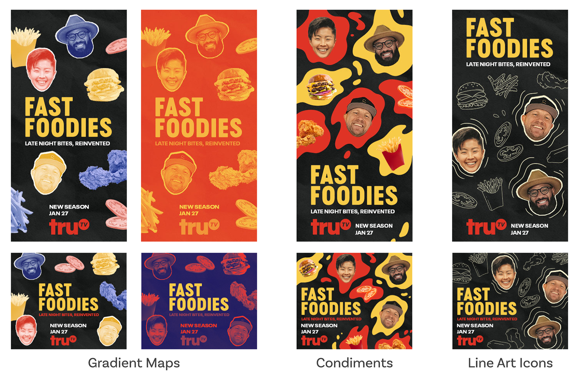
In my first round of designs, I created 3 concepts that each tied into elements of the show's voice. The gradient map idea is meant to convey the hip, young audience and give off the "late-night" mood. The show is a laid-back cooking competition, so the concept with blobs of colors that look like condiments gives off a friendly "food fight" energy. The final design uses line art icons I drew that creates a look reminiscent of a restaurant chalk board menu.
Round 2 Designs
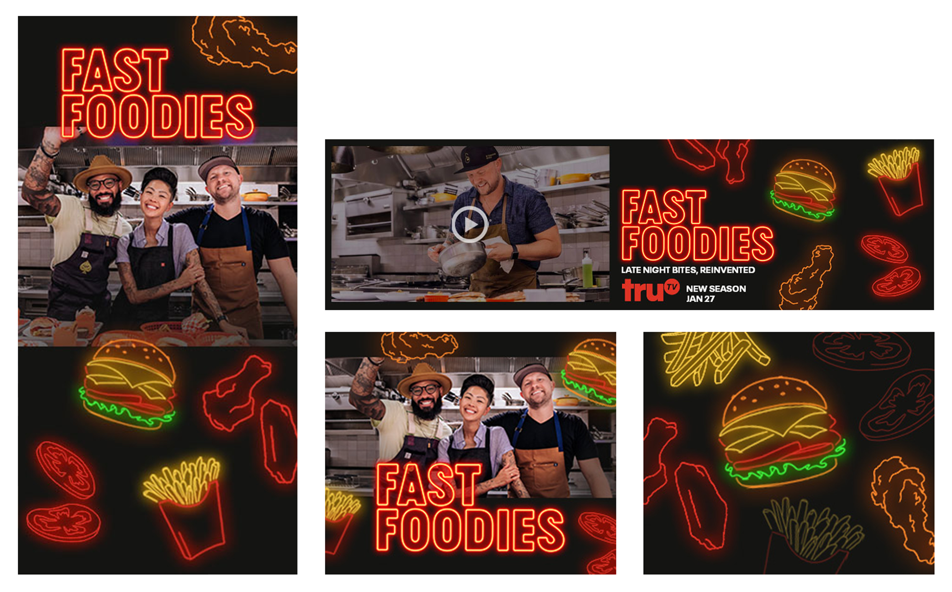
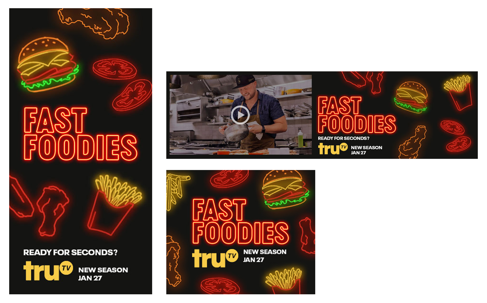
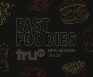
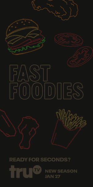
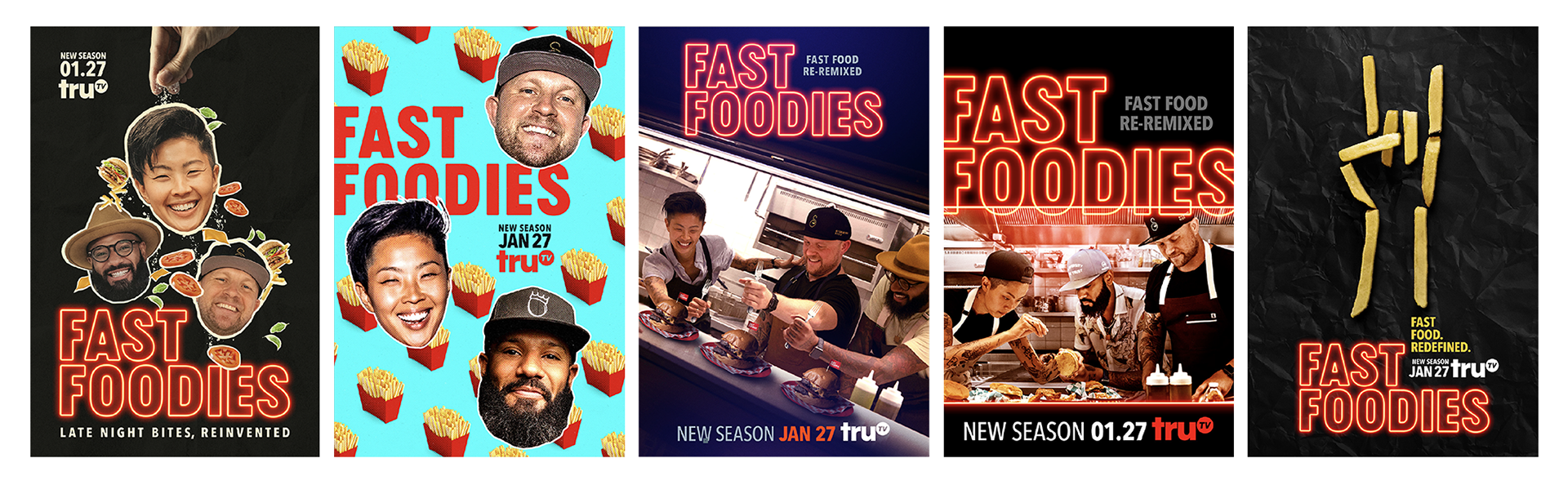
TruTV liked the line art icon concept best but wanted to go with a neon look that would remind viewers of a late-night drive through.
Final Designs